Hi SharePoint fellows,
In this post, I would like to tackle a user experience I wanted to implement in one of my projects in the SharePoint modern experience: A contextual command opening a form contained in a panel.
Let’s use SPFx extensions
A contextual command means I would need to implement a ListView Command Set extension. Using this kind of solution, I am able to add a contextual button in the command bar and in the contextual item menu. For those of you familiar with the classic experience development, it is the successor of Custom Actions located in the ribbon and the ECB.
From the official documentation, we can find a very well explained tutorial explaining how to implement this custom command.
I don’t want a dialog !
When the need comes for a custom UI in the context of a ListView command set, the offered possibility is the use of the Dialog API. This API wraps prepared Office UI Fabric dialogs, either standard prompt or alert or with custom dialog content. It is quite easy to use once you know how to do it 😉 Check out the official tutorial to learn more.
In most cases, the dialog approach is a good fit, when UI is quite small and the user action flow is straight-forward, it’s probably not worthy to do anything else.
In my case, however, I needed a larger, more complex and dynamic UI. I had not a good feeling about using a dialog for that. Moreover, A nice-to-have I had in mind was that the user could be able to still see the content of the list while working in the custom form, the dialog wouldn’t fit this one.
What about a panel instead ?
Using the Office UI Fabric React library, we can easily use a Panel and implement our own content in it. The only thing we need is to call the render() method from the ReactDOM.
It actually turns out to be a bit tricky, because this render() method requires to pass in a container DOM element. in ListView Command Set SPFx extensions, unlike the Application Customizers, we don’t have direct access to the any DOM element through standardized available placeholders. That said, we are developing in JavaScript, that means we can still manipulate everything in the DOM !
DOM Injection is officially discouraged !
Those who know me will be aware that I’m pretty in line with Microsoft’s recommendation about NOT doing DOM injection in SharePoint UI development. It actually means you should avoid messing around with the standard SharePoint UI. The SharePoint developers struggle to deliver the best user experience with many advanced features, and there are new stuff almost every week ! The DOM of the SharePoint pages is continuously evolving. you CAN’T and SHOULDN’T rely on the existence or the format or content of any particular HTML element because you have no assurance it will be there and remain the same forever. Moreover, altering these elements might end up in breaking a standard SharePoint UI feature.
With this recommendation taken into account, we can, however, be pretty sure that one special HTML element will always be there; the <body> element. We won’t alter or remove any child element from it but instead adding one simple <div> element that will be the container for our React control.
Let’s implement it !
As a sample, let’s assume the following requirements:
- The solution is for SharePoint Modern UI only
- We need a custom button in the command bar
- The button only appears when a single item is selected
- When the button is clicked, a panel pops up
- The panel contains a simple form allowing to update the Title field of the item
We will create such a solution in the form of a ListView Command Set solution. I won’t go too much into the basic details here, If you need more details, you can check the following tutorial.
The prerequisites
The main thing we will require is to install the React dependencies in our solution in order to be able to use the Office UI Fabric React component. I also install the PnP JS library dependencies for the sake of simplicity
When your solution is scaffolded, type the following command in your console
npm install react react-dom @types/react @types/react-dom @pnp/common @pnp/logging @pnp/odata @pnp/sp –save
For some reasons I didn’t dig into, the latest versions of React libraries caused the solution not being able to build (something related to React prop types, …). If you run into the same problem, here are the React version that worked I just grab from another extension solution that I had:
Okay, ready to code !
First, let’s create a React component that will render the Panel and its content. In my solution, I have a component source file called CustomPanel.tsx within the src/components folder.
This file contains bidirectional Unicode text that may be interpreted or compiled differently than what appears below. To review, open the file in an editor that reveals hidden Unicode characters.
Learn more about bidirectional Unicode characters
| import * as React from 'react'; | |
| import { TextField, DefaultButton, PrimaryButton, DialogFooter, autobind, Panel, Spinner, SpinnerType } from "office-ui-fabric-react"; | |
| import { sp } from "@pnp/sp"; | |
| export interface ICustomPanelState { | |
| saving: boolean; | |
| } | |
| export interface ICustomPanelProps { | |
| onClose: () => void; | |
| isOpen: boolean; | |
| currentTitle: string; | |
| itemId: number; | |
| listId: string; | |
| } | |
| export default class CustomPanel extends React.Component<ICustomPanelProps, ICustomPanelState> { | |
| private editedTitle: string = null; | |
| constructor(props: ICustomPanelProps) { | |
| super(props); | |
| this.state = { | |
| saving: false | |
| }; | |
| } | |
| @autobind | |
| private _onTitleChanged(title: string) { | |
| this.editedTitle = title; | |
| } | |
| @autobind | |
| private _onCancel() { | |
| this.props.onClose(); | |
| } | |
| @autobind | |
| private _onSave() { | |
| this.setState({ saving: true }); | |
| sp.web.lists.getById(this.props.listId).items.getById(this.props.itemId).update({ | |
| 'Title': this.editedTitle | |
| }).then(() => { | |
| this.setState({ saving: false }); | |
| this.props.onClose(); | |
| }); | |
| } | |
| public render(): React.ReactElement<ICustomPanelProps> { | |
| let { isOpen, currentTitle } = this.props; | |
| return ( | |
| <Panel isOpen={isOpen}> | |
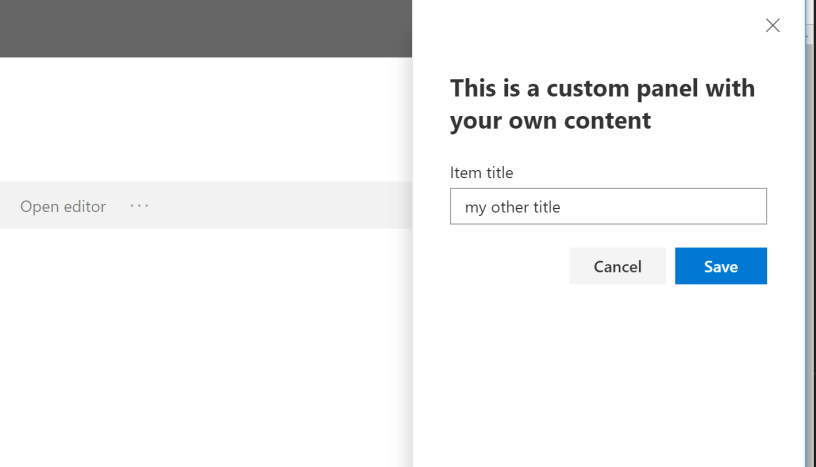
| <h2>This is a custom panel with your own content</h2> | |
| <TextField value={currentTitle} onChanged={this._onTitleChanged} label="Item title" placeholder="Choose the new title" /> | |
| {this.state.saving && <Spinner type={SpinnerType.large} label="Saving…" />} | |
| <DialogFooter> | |
| <DefaultButton text="Cancel" onClick={this._onCancel} /> | |
| <PrimaryButton text="Save" onClick={this._onSave} /> | |
| </DialogFooter> | |
| </Panel> | |
| ); | |
| } | |
| } |
This component renders a simple form contained in a Panel component. When the Save button is clicked, A REST call (using PnP JS) will update the title of the current item.
In our Extension main class, let’s do some changes, First we need to create the container for our SPFx component :
This file contains bidirectional Unicode text that may be interpreted or compiled differently than what appears below. To review, open the file in an editor that reveals hidden Unicode characters.
Learn more about bidirectional Unicode characters
| // … | |
| import CustomPanel, { ICustomPanelProps } from "./components/CustomPanel"; | |
| import { sp } from "@pnp/sp"; | |
| import { autobind, assign } from '@uifabric/utilities'; | |
| // … | |
| const LOG_SOURCE: string = 'CustomFormPanelCommandSet'; | |
| export default class CustomFormPanelCommandSet extends BaseListViewCommandSet<ICustomFormPanelCommandSetProperties> { | |
| private panelPlaceHolder: HTMLDivElement = null; | |
| @override | |
| public onInit(): Promise<void> { | |
| Log.info(LOG_SOURCE, 'Initialized CommandSetWithPanelCommandSet'); | |
| // Setup the PnP JS with SPFx context | |
| sp.setup({ | |
| spfxContext: this.context | |
| }); | |
| // Create the container for our React component | |
| this.panelPlaceHolder = document.body.appendChild(document.createElement("div")); | |
| return Promise.resolve(); | |
| } | |
| // … | |
| } |
We create the DOM element in the extension initialization step and keep a reference to it.
This file contains bidirectional Unicode text that may be interpreted or compiled differently than what appears below. To review, open the file in an editor that reveals hidden Unicode characters.
Learn more about bidirectional Unicode characters
| // Other code here… | |
| import * as React from 'react'; | |
| import * as ReactDom from 'react-dom'; | |
| // Other code here… | |
| export default class CustomFormPanelCommandSet extends BaseListViewCommandSet<ICustomFormPanelCommandSetProperties> { | |
| // Other code here… | |
| private _showPanel(itemId: number, currentTitle: string) { | |
| this._renderPanelComponent({ | |
| isOpen: true, | |
| currentTitle, | |
| itemId, | |
| listId: this.context.pageContext.list.id.toString(), | |
| onClose: this._dismissPanel | |
| }); | |
| } | |
| @autobind | |
| private _dismissPanel() { | |
| this._renderPanelComponent({ isOpen: false }); | |
| } | |
| private _renderPanelComponent(props: any) { | |
| const element: React.ReactElement<ICustomPanelProps> = React.createElement(CustomPanel, assign({ | |
| onClose: null, | |
| currentTitle: null, | |
| itemId: null, | |
| isOpen: false, | |
| listId: null | |
| }, props)); | |
| ReactDom.render(element, this.panelPlaceHolder); | |
| } | |
| } |
We implement the methods that will help display and close the Panel. Notice that we grab the List ID our component needs from the current page context.
This file contains bidirectional Unicode text that may be interpreted or compiled differently than what appears below. To review, open the file in an editor that reveals hidden Unicode characters.
Learn more about bidirectional Unicode characters
| // imports … | |
| export default class CustomFormPanelCommandSet extends BaseListViewCommandSet<ICustomFormPanelCommandSetProperties> { | |
| //… | |
| @override | |
| public onListViewUpdated(event: IListViewCommandSetListViewUpdatedParameters): void { | |
| const openEditorCommand: Command = this.tryGetCommand('CMD_PANEL'); | |
| openEditorCommand.visible = event.selectedRows.length === 1; | |
| } | |
| @override | |
| public onExecute(event: IListViewCommandSetExecuteEventParameters): void { | |
| switch (event.itemId) { | |
| case 'CMD_PANEL': | |
| let selectedItem = event.selectedRows[0]; | |
| const listItemId = selectedItem.getValueByName('ID') as number; | |
| const title = selectedItem.getValueByName("Title"); | |
| this._showPanel(listItemId, title); | |
| break; | |
| default: | |
| throw new Error('Unknown command'); | |
| } | |
| } | |
| //… | |
| } |
And we finally edit the extension life cycle handlers to suit our needs. The command has a token CMD_PANEL. The button shows up only if a single list item is selected, and when clicked, will open up the panel passing it in the arguments that will help us working on the selected item.
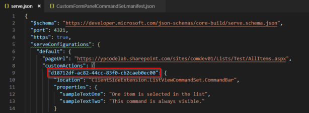
Since we used a custom token for our command, we will need to update the manifest accordingly. Edit the content of the YourCommandSet.manifest.json and change the value of the items property to :


Select an item and see the Open editor button appearing in the command bar, click this button to see the following panel showing up

And there is it, we can now open up a panel with our custom content within the context of an SPFx ListView Command Set extension.
It works !
- We don’t affect anything in the existing DOM
- We rely on the only thing that will probably remain forever (except if HTML basics changes completely, which is unlikely…)
 YP code
Hello. Thank you very much. I have tested this and everything is working perfectly. Maybe I have one question …I know that injections is not good but I need to override for example button Edit….with this type of custom panel….So I don’t want to have new button but have old button but with opening my custom panel….I have tested many my own type of solution with SPFX Extension Application Customizer but nothing work….Do you think is possible to override click on this button somehow.
Thank you.
LikeLike
Hi Vladimir, AFAIK there is currently no officially supported way for such customization with custom panel in SPFx, one might think that with some « bad » injection you can put some CSS the hide the standard edit button in order for your custom one to be the only one available, I’ll let you know if I learn something more appropriate 😉
LikeLike
When I do run a panel in SPFX and click on the close button – the Sharepoint background is still grey.. do I have to unmount the react object somehow ? Any help would be awesome.
LikeLike
Yes, actually not unmount it but make it not visible check out the sample solution code here https://github.com/ypcode/ypcode-spfx-samples/tree/master/spfx-panel 🙂
LikeLike
Most helpful, but when I implemented your design , I get the error this.props.onClose is not a function on the _oncCancel method.. is this something to do with @autobind ? Is there any autobind configuration needed ?
LikeLike
Most likely! If you don’t use autobind you’d need to set the onCancel as « onCancel={this.cancel.bind(this)} or « onCancel={() => this.cancel()}» it is due to JS , when you pass the function reference « this » represents the caller except if you explicitly bind it to another object
LikeLike
Great article. Would you be willing to share the source code please? Thanks
LikeLike
Thank you! Sure it’s available on github here https://github.com/ypcode/ypcode-spfx-samples/tree/master/spfx-panel 🙂 have fun !
LikeLiked by 1 person
Awesome, got me on the right track – many thanks
LikeLike
Panel works great. Want to use this to create custom forms. One problem though – list view data refresh takes too long.
Are you aware of a way to trigger page refresh without actually reloading the entire page.
LikeLike
Hi I don’t know if any « standard » technique to achieve this, the refresh is an otb feature that is not really triggered on the UI side by our changes… the only way I can think of so far is by combining multiple extensions to override and control the rendering but it’s a bit of overkill…
LikeLike
Hi, i am getting error of autobind while updated fabric module. Can you please suggest something?
LikeLike
I have already updated office fabric module but still no success. Can you please help.
LikeLike
Hi @autobind is a helper that is now deprecated, to achieve the exact same behavior, in the constructor of the class, you can instead write for each method decorated with @autobind something like
this._onTitleChanged = this._onTitleChanged.bind(this); and you can remove all usages of @autobind 🙂 Hope it helps ! 🙂
LikeLike
Another way to get rid of the need of @autobind is to write your callback
methods in the form “private _onTitleChanged = (title: string) => { … };”
LikeLike
Thanks YPCode for quick reply. Actually issue is here on close button.. where i am trying code like below on my .tsx file this._onCancel(this)} /> and now trying to close the panel inside _onCancel method but no success any how. Any help will be highly appreciated!!
LikeLike
Hi, it’s really the issue of the this reference, you must absolutely use one of the 2 mentioned ways to make it work:
– In the constructor of the class, add a line this._onCancel = this._onCancel.bind(this);
OR
– instead of declaring the method as
private _onCancel() {
Write it as
private _onCancel = () => {
LikeLike
Hey thanks but neither of option is working for me. Sorry but, have you tried these options by yourself? As a alternative i have reload the page as of now, but thats not best solution.. if you try and test your approach please let me know. Thanks.
LikeLiked by 1 person
I did not retest this particular example with latest versions of SPFx, but the technique by itself, I used it quite a lot and it always worked well. Feel free to share the code not working on your side, I’ll have a look and hopefully tell you what’s wrong 🙂
LikeLike
ok, please paste here what will be code inside private _onCancel = () => {
inside this block? Thats problem here.. if you can provide working one.. i am sure it will work.
LikeLike
The exact same body as in the sample
this.props.onClose();
LikeLike
Do you have any error message in the console logs?
LikeLike
I am going to offer up an alternative. The above panel method works, but it is quite cumbersome.
SPFX already provides a dialog option that is well documented. You can include a Panel in the dialog. Rather than fighting the tide, use a dialog to open the panel and if you don’t want to see the dialog – just hide it. That gets you where you want to be using the placeholders designed into SPFX. It will last longer.
LikeLike
Hi, thanks for your comment, standard SPFx placeholders are not directly accessible from ListView extensions, The dialog framework in SPFx is using exactly the same technique described here, and it requires to implement the content of the Dialog, IMHO, it is way more cumbersome to use a dialog to host a panel… Do you have any sample for this so I can maybe better understand the advantage ?
LikeLike
Well – just use this example https://docs.microsoft.com/en-us/sharepoint/dev/spfx/extensions/guidance/using-custom-dialogs-with-spfx
Then change the render to be a Panel instead of . Voila.
If you use a large panel – the panel hides the diaglog. If not, then use this to hide the dialog from within the dialog render function.
const dialogElement = document.getElementsByClassName(“ms-Dialog-main”)[0] as HTMLDivElement;
dialogElement.style.display = “none”;
Works like a charm.
LikeLike
I see your point… it’s however using something that’s not designed at all to achieve that and I wouldn’t rely on this API to show any element that is totally unrelated. Moreover you are using DOM manipulation that is highly discouraged and not supported. For those reasons , I am sorry but I humbly think the alternative you offer isn’t reliable…
LikeLike
this._renderPanelComponent is not a function
at Object.xRvS.HelloWorldCommandSet._dismissPanel [as onClose] (HelloWorldCommandSet.ts:50)
at CustomPanel._this._onCancel (CustomPanel.tsx:45)
at Object.onClick (CustomPanel.tsx:80)
at BaseButton._this._onClick (BaseButton.js:191)
at Object.u (react-dom-16-bundle_1004f410c59dd9fd8d95f5e7390ad272.js:1)
at m (react-dom-16-bundle_1004f410c59dd9fd8d95f5e7390ad272.js:1)
at react-dom-16-bundle_1004f410c59dd9fd8d95f5e7390ad272.js:1
at S (react-dom-16-bundle_1004f410c59dd9fd8d95f5e7390ad272.js:1)
at O (react-dom-16-bundle_1004f410c59dd9fd8d95f5e7390ad272.js:1)
at P (react-dom-16-bundle_1004f410c59dd9fd8d95f5e7390ad272.js:1)
LikeLike
Still look exactly the same reason, let me rework the an updated, hopefully it’ll help you
LikeLiked by 1 person
Okay I think I got it, have you well done the same change on the _dismissPanel() method that is also using an @autobind ? this one should also be rewritten as private _dismissPanel = () => {
LikeLike
https://github.com/ypcode/ypcode-spfx-samples/blob/4d13394595f0c597affef1bc48ff518ae010320d/spfx-panel/src/extensions/panelCommandSet/PanelCommandSetCommandSet.ts#L83
LikeLike
Yes that worked. Thanks.
LikeLike
The close button is working fine after making the change but “cross” button on the top of the panel is not working. How can this be fixed?
LikeLike
Great solution! Got inspired a lot:) Im trying to use a customized panel in the extension to render some components from a webpart. Works great. but one problem is that I have problem to reset the values in the webpart component after the panel got closed. When you reopen the penal, the values in the component are still there. Any idae how to reset the component values?
LikeLike
Hello, you can hook to the onDismiss panel of the event to make sure you clear the values, more radical is to recreate a new holder div at each opening so you will force recreating a new component. But this last one might have some performance impact
LikeLike